
Stillwell Aesthetics · Aesthetics & wellness
An approachable first conversation.
Helping unfamiliar treatment choices feel understandable.
Concept case study. A fictional brand and business scenario, not a commissioned client project or measured-results claim.
The business scenario
Making the business easier to choose.
An aesthetics studio with several treatment families, a considered approach and individual provider profiles.
What stands in the customer’s way
A treatment-aware visitor wants direct information. A first-time visitor may not know treatment names or feel ready to choose. The experience needed to serve both without making treatment the assumed next step.
The customer’s perspective
What customers need to know.
- Discover a relevant treatment without knowing every clinical term.
- Understand the studio’s approach before considering a consultation.
- Find a low-pressure way to ask questions.
What we created
A design with the customer in mind.
- 01
Give every treatment a clear destination.
Four image-led treatment paths lead to dedicated pages. Each page has room for an approachable explanation and supporting questions, helping service-aware visitors find specifics without making new visitors scan an undifferentiated menu.
The intended benefit: a complex menu becomes a set of understandable choices.
- 02
Build a calm, recognizable identity.
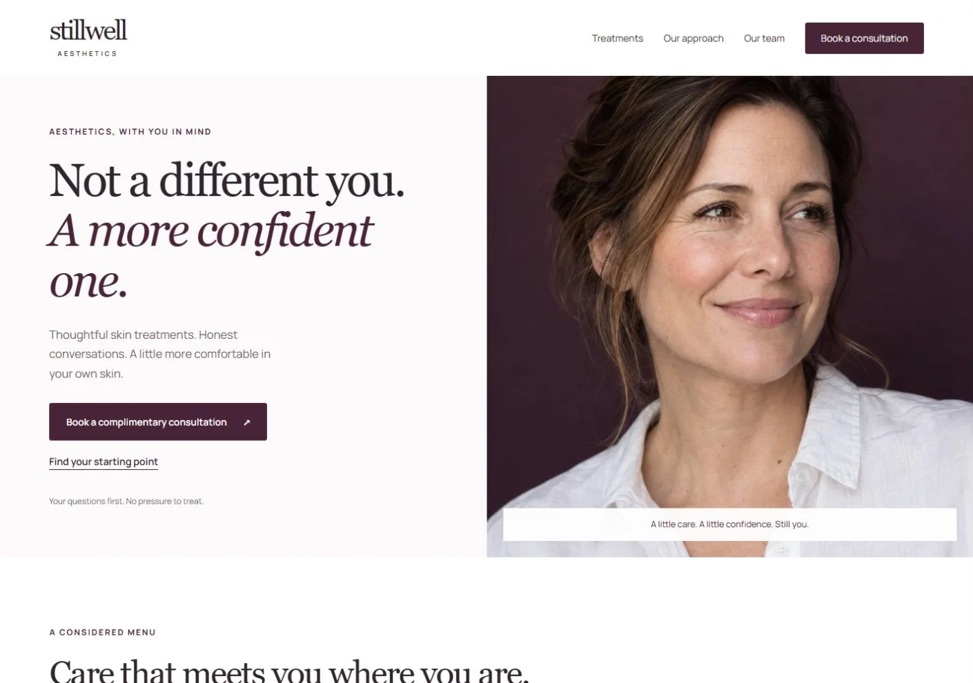
Deep plum, quiet white space and natural portraiture create a restrained visual language. Type, image scale and spacing carry the same tone from the homepage into treatment and provider pages.
The intended benefit: the business is presented with a consistent, considered character.
- 03
Let visitors investigate the approach.
The studio’s approach and provider information have direct destinations. Expandable backgrounds let readers look closer without crowding the initial page. The content supports questions rather than assuming a treatment decision.
The intended benefit: visitors can assess the experience before taking a next step.
- 04
Make the consultation journey tangible.
The booking interface demonstrates consultation type, provider, date and example time selection. It illustrates how a focused appointment journey can work while keeping an initial conversation distinct from committing to treatment.
The intended benefit: interface design makes the possible next step easier to picture.
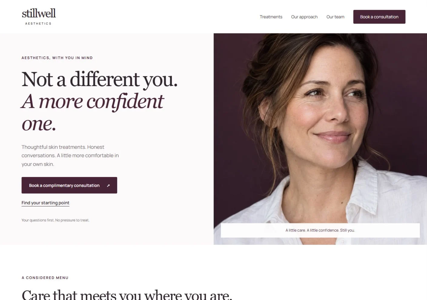
Explore the live concept to experience the pages and interactions.
See it in action
Useful details. A memorable presentation.
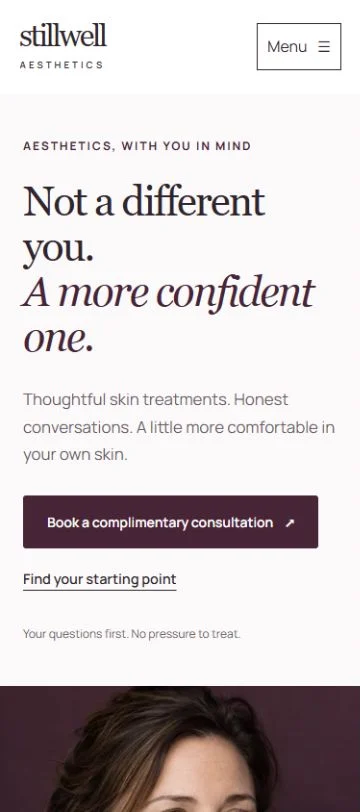
The homepage establishes the studio’s calm visual language and gives its offer an approachable introduction.
Explore Stillwell AestheticsOne useful visitor journey
From interest to a relevant next step.
- 1. DiscoverExplore the studio and treatments.
- 2. UnderstandRead a relevant treatment page.
- 3. Get comfortableInvestigate the approach and people.
- 4. Ask a questionExplore the consultation journey.
What this work demonstrates
Sensitive service communication, a differentiated visual identity and thoughtful paths for both informed and uncertain visitors.
Scope & context
Treatment, approach and provider pages with an appointment-interface demonstration. Booking is not connected to live availability. This work demonstrates website design, not clinical expertise or treatment outcomes.
The benefits described here are design intentions, not measured business results. This concept demonstrates the work and reasoning Eventide can bring to an appropriate project.
Explore the website serviceA better next chapter
Give your customers more reasons to choose you.
We’ll bring the same attention to your services, your story and the people you want to reach.
Start my website